
Bedtime stories have a unique power to transport children to fantastical worlds, filled with magic, wonder, and of course, enchanting creatures. Among the most beloved of these are mermaids – mythical beings that embody grace, beauty, and a connection to the ocean’s mystery. Their depictions in illustrations, especially for younger audiences, rely heavily on a carefully chosen color palette that contributes to the overall mood and storytelling. Understanding these colors isn’t just about aesthetics; it’s about understanding how illustrators communicate feelings of calm, excitement, and enchantment.
The selection of colors for mermaid illustrations isn’t random; it’s a thoughtful process that considers the cultural context of the story, the mermaid’s personality, and the desired emotional impact. Often, softer, more pastel shades dominate, fostering a sense of peace and serenity conducive to a relaxing bedtime routine. However, splashes of bolder, more vibrant colors can be strategically employed to represent the mermaid’s energy, adventure, or perhaps even a hint of mischief. This deliberate use of color significantly shapes the child’s perception of the mermaid and the world she inhabits.
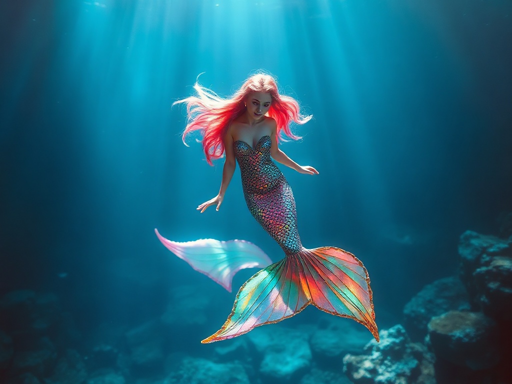
## Aqua and Turquoise: The Essence of the Sea
The foundational colors of any mermaid illustration are undoubtedly aqua and turquoise – shades directly inspired by the ocean. These hues evoke feelings of tranquility, coolness, and openness, mirroring the vastness and serenity of the sea. Using varying tones of aqua and turquoise allows illustrators to represent different depths and light conditions underwater, creating a sense of realism despite the fantastical subject matter. The subtle gradients and mixing of these colors can depict shimmering water, swaying seaweed, and the play of sunlight filtering through the waves.
Beyond simply mimicking the sea, aqua and turquoise can also be used to symbolize the mermaid’s connection to the elemental power of water. A brighter, more vibrant turquoise might represent a lively, playful mermaid, while a deeper, more muted aqua could signify wisdom, patience, and a connection to ancient sea lore. These color choices subtly communicate aspects of the mermaid’s character without resorting to direct descriptions. The range within these core colors offers incredible versatility for illustrators.
The prevalence of aqua and turquoise is further cemented by their association with calmness and relaxation, key components of a bedtime story’s atmosphere. These colors are proven to be soothing to the eye, promoting a sense of peace and well-being – perfect for a child winding down for the night. They represent safety and familiarity, instantly grounding the fantastical element of the mermaid within a relatable and comforting visual language.
## Pinks and Purples: A Touch of Enchantment
While blues and greens dominate, the inclusion of pinks and purples adds a layer of fantasy and enchantment to mermaid illustrations. Soft pinks can evoke a sense of sweetness, innocence, and gentle beauty, particularly suitable for mermaids portrayed as kind and nurturing figures. These shades soften the overall image, making the mermaid appear approachable and less intimidating to young children. The use of these colours are extremely popular in children’s literature.
Lavender and lilac hues contribute a touch of mystique and magical realism, suggesting the presence of hidden powers or a connection to a secret, underwater realm. They can indicate a mermaid who is wise, ethereal, or possesses a unique ability. The blend of purple and blue creates a fascinating spectrum, allowing illustrators to capture the shifting colors of twilight under the ocean surface. These colours contribute to the sense of otherworldliness.
However, the use of pinks and purples needs to be balanced. Overuse can create a saccharine or overly stylized image. The most effective illustrations integrate these colors subtly, often as accents in the mermaid’s tail, hair, or accessories, providing a pop of color without overwhelming the overall composition. A gentle application makes the illustrations pop even more.
## Gold and Silver: Shimmering Magic
Gold and silver are frequently used in mermaid illustrations to represent wealth, treasure, and magical properties. These metallic tones suggest the mermaids are guardians of hidden riches or possess innate magical abilities tied to precious metals. Often, these colors are incorporated into the mermaid’s crown, jewelry, or even woven into the scales of her tail, emphasizing her royal status or unique gifts. The sparkle catches the light and immediately draws the viewer’s eye.
The shimmer of gold and silver also adds a visual dimension of movement and fluidity. They can be used to depict the way light plays across the surface of the water, creating a sense of dynamism and life within the illustration. Imagine swirling gold highlights in a mermaid’s hair, suggesting currents and waves – it adds depth and visual interest to the overall design. This visual interest is vital for captivating a young audience.
Despite their luxurious associations, gold and silver can also be incorporated in subtle ways to maintain the bedtime story’s gentle tone. A delicate silver shimmer on the scales of the tail, or a subtle gold highlight in the mermaid’s eyes, can be enough to convey magic without making the illustration feel too extravagant or stimulating. Ultimately, the balance lies in showcasing a quiet elegance.
## Coral and Peach: Warmth and Friendship
While blues and purples dominate the cool spectrum, coral and peach introduce a sense of warmth, friendliness, and camaraderie to mermaid illustrations. These colors, reminiscent of tropical reefs and seashells, can soften the mermaid’s appearance, making her seem more approachable and less distant. They are particularly effective when portraying mermaids who are sociable, helpful, or have close relationships with other sea creatures. These colors offer a comforting contrast to the cooler hues.
The usage of coral and peach can also symbolize the mermaid’s nurturing qualities, particularly if she’s depicted caring for other marine life. These colors evoke feelings of safety, warmth, and home – a gentle reminder of comfort and security – ideal for a bedtime narrative. They represent a gentler, more emotional connection with the environment, subtly teaching children about compassion and environmentalism.
The intelligent combination of these warm tones with cooler blues and greens creates a harmonious balance within the illustration, preventing the image from becoming overwhelming or visually jarring. A touch of coral in the seaweed, or a peach hue in the sunset reflected on the water, can add a sense of depth and realism, grounding the fantastical elements within a familiar visual landscape.
## Conclusion
The colors employed in mermaid illustrations for bedtime stories are more than just aesthetically pleasing; they are a crucial component of storytelling, shaping the narrative and evoking specific emotions in young viewers. From the calming blues of the ocean to the enchanting touches of pink and purple, each color choice contributes to the overall atmosphere of wonder and relaxation.
Ultimately, understanding the language of color in these illustrations allows us to appreciate the artistry and careful planning that goes into creating these magical worlds. The use of color in these depictions helps immerse children in the narrative, sparking their imagination and fostering a love of storytelling, ensuring a peaceful and dream-filled night’s sleep.
Related Articles